
Monday, June 30, 2014
GIANTS
Playing with painter more after finishing my digital painting class. Working the color values for the perspective was a lot of fun, I always feel like I need to keep tweaking things so Ill probably end up doing more work on this.
Saturday, June 21, 2014
Mask and Contraption - Digital Painting 1
One more assignment/week left of Digital Painting 1. Its been good to be pushed and learn a new program, as well as work with the other students in the class. It's fun to be part of the creative flow that goes back and forth through everyone, its a need thing to see. Here is "Mask" which, like always, started small and grew. I hope to "glaze" some color over it watercolor style and see what happens, add some bright colors to the helmet maybe, but I also like the high contrast look that kind of grew, which would be less saturated. Might be perfect for watercolor. If anyone is interested ill try and get a progression post on this from start to finish.


Also, here is my "Contraption" from last week which was also a lot of fun. I tend to add details in small, which may not be visible at normal size, I'll have to watch that and not waste time if its not improving anything.
Friday, May 30, 2014
Universamatamaton 9000 (Universe theme) Digital Painting I WK3
Again I was a bit indecisive with the image I wanted to create for this weeks theme. Working in Painter X3 there is definitely a learning curve with respect to the amount of features that are available and past that, in trying to use these in a way that does not look juvenile. I think I am happiest with the way the galaxies turned out, although I may need to add a bit more variation to them. Also, creating a brush to apply the stars turned out to work very well. Thanks Don Seegmiller! (http://seegmillerart.com/) Creating the background was also fun and a learning experience. I wasnt sure if I should contrast a fairly realistic, semi warm background with a sketchy cooler focus, but i decided to try it. Not on par with where I want to be for sure, but I hope I still see improvement. Next weeks theme: Temptation. Uh-huh, well see how that turns out.

Retroooooo - or not so much. Digital Painting I WK2
Last weeks (well, now its last last weeks) theme was "retro". I always seem to have a hard time coming up with concepts that i think are creative enough and so I went back and forth on this a lot. I settled on a retro pinup type idea. I was experimenting with the digital watercolor brushes available in Painter X3 and did this Koi design that I liked. This of course meant it had to be incorporated and so... it may have strayed a bit from the theme, but as i started working further into it, I enjoyed it. The background is not complete, or as complete as i would like, but I am semi satisfied with the figure and material at this point. Who knows, maybe a reboot is in the future!

Friday, May 16, 2014
Digital - "Voyage"
Here is the first project from a Digital Painting I class i'm taking this summer. We are pulling topics from Illustration Friday, and this last week it was "Voyage". Working in Painter X3, loving some things and finding it hard to do others, which should get better as I get more comfortable. Should be posting one of these every week so check back and hopefully these will keep getting better!

Monday, May 5, 2014
Illustrations, Environments
Also from classwork, here are a few of the illustrations I completed when we were given some specifications (different perspectives, illustrating a concept or idea etc). These were all done traditionally, mostly with Prismacolor markers, and some combination of Nupastel, graphite or ink. All monochrome (black/white, shades of grey in this case).
 |
| Frog Royalty, monocle required. |
 |
| Isometric underwater architecture |
 |
| 1 Pt perspective environment, wanted to go back and add some glowing lines digitally. Might be fun in color. |
 |
| 2 Pt castle type scene. |
 |
| 3 Pt (not pushed) scene which needs more contrast to break out the elements. |
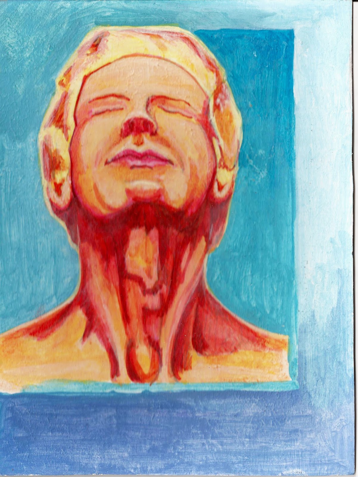
Acrylics, frustration and a little improvement!
After just finishing another semester, I have definite mixed feelings. They say it is pretty common to feel like you are getting worse as you develop due to the fact that you are seeing and understanding more of what should be there (and may or may not be). I am definitely experiencing this. That being said, after going back and scanning my projects in, I can at least see some progress as well. I also really appreciate the feedback and help of my faculty this semester.
So, I'll go ahead and post a progression of my acrylics over the last semester. Hopefully in the future I'll get better at making weekly updates so I can comment on the things that I learned from a particular piece. I also had a run in with hot press illustration board the first few weeks, which makes painting on it...well, it makes it about 50 times harder. Also, specific elements such as color combinations, textures, brushing techniques etc were given in different assignments, which may be why it seems a bit strange at times. Hopefully as I have time, I can go through and add some captions giving a bit more detail.


So, I'll go ahead and post a progression of my acrylics over the last semester. Hopefully in the future I'll get better at making weekly updates so I can comment on the things that I learned from a particular piece. I also had a run in with hot press illustration board the first few weeks, which makes painting on it...well, it makes it about 50 times harder. Also, specific elements such as color combinations, textures, brushing techniques etc were given in different assignments, which may be why it seems a bit strange at times. Hopefully as I have time, I can go through and add some captions giving a bit more detail.
 |
| Master copy from a digital piece. |
 |
| Master copy, one of my favorite pieces I did this semester. Was done on gesso, building up acrylic washes. |
 |
| Master copy from Mr. Bennet. |
Subscribe to:
Posts (Atom)